The Client
Carbon Neutral Fuels believes in connecting the world through sustainable flight. They see a future where clean aviation is the norm, not the exception. In a world racing toward decarbonisation, they’re working to make sustainable aviation fuel the first choice for airlines, investors, and communities alike.
The Challenge
The brand’s existing identity didn’t fully convey Carbon Neutral Fuel’s bold ambition to transform the landscape of sustainable aviation fuel (SAF). We needed to transform their brand into one that reflected their technical expertise, deep environmental commitment, and bold vision for a world free from fossil fuels. The rebrand had to resonate with industry leaders, investors, and partners, while clearly signalling CNF’s position as a trailblazer in the sustainable energy space.
The Process
We began by immersing ourselves in CNF’s mission, values, and ambitions. Workshops with co-founders Sophie Zienkiewicz and Alasdair Lumsden revealed a recurring theme of connection - between science and nature, innovation and purpose, people and planet. This idea became the foundation for the new identity. The design approach combined precision with warmth, reflecting both the analytical nature of their work and the environmental purpose behind it. From here, we explored how logo, colour, texture, and imagery could come together to form a unified and distinctive brand language.
The Solution
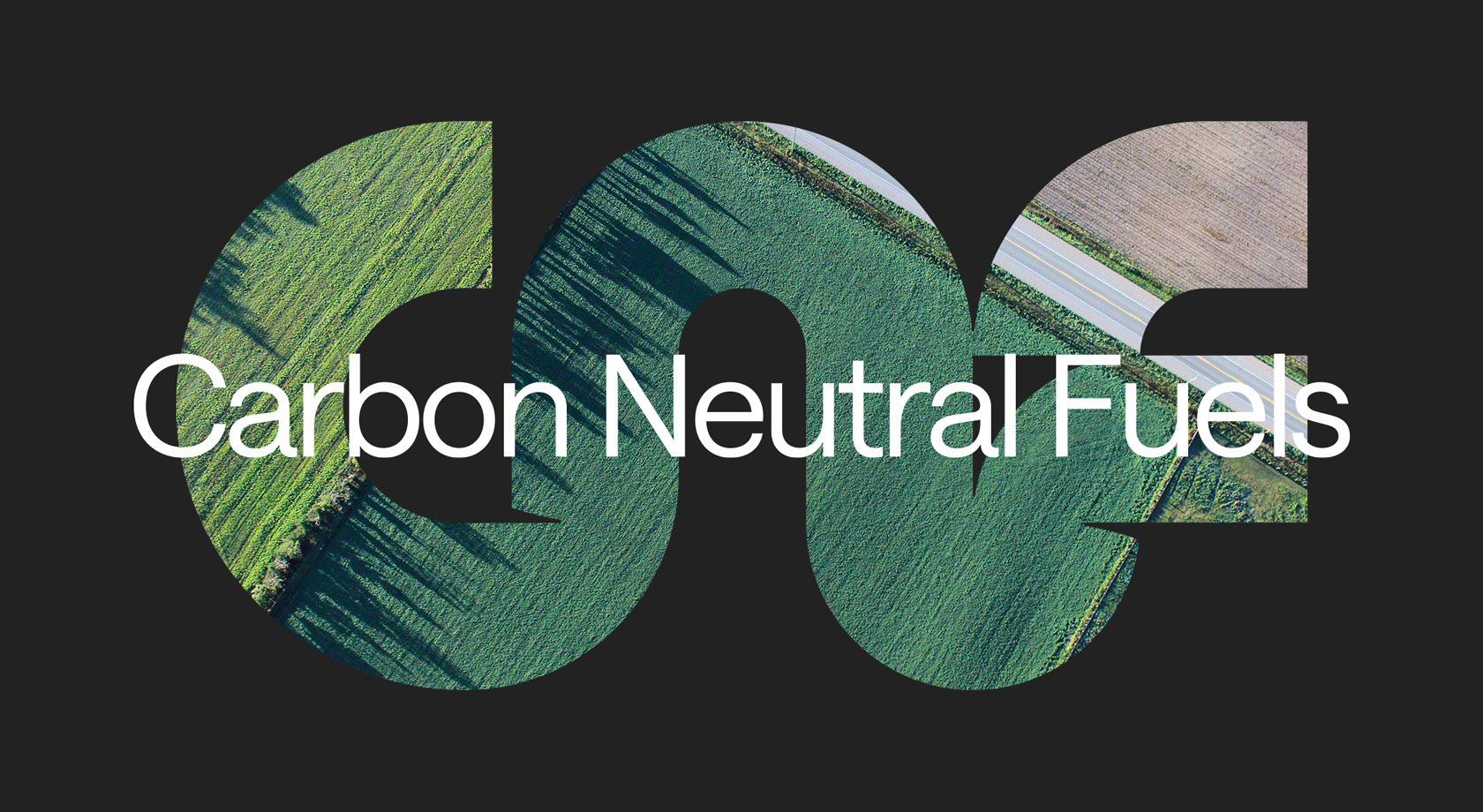
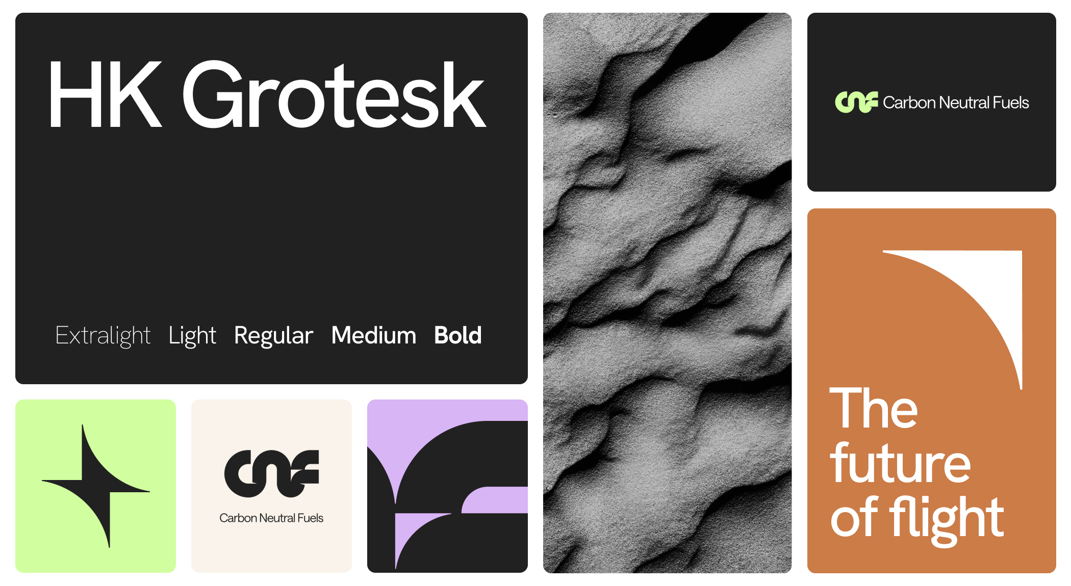
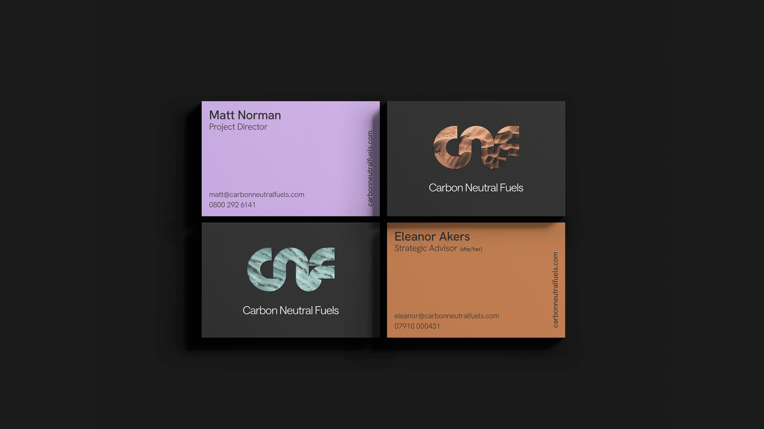
The new Carbon Neutral Fuels logo is an abstract representation of the brand’s initials, with each letter seamlessly connected to symbolise collaboration and momentum. Subtle shadowing within the mark hints at the tip of an aircraft wing, anchoring the brand in the aviation sector. A small arrow in the negative space reinforces the sense of progress and forward thinking. The colour palette was inspired by a plane’s-eye view of the planet, from rich, earthy pigments to deep greens and iridescent turquoises. Each shade is named after minerals and flora, grounding the identity in the natural environment CNF is committed to protecting. Textures drawn from cracked stone, rippling water, and grains of sand bring a tactile quality to the brand, serving as a reminder of what’s at stake. This natural inspiration is balanced by an X-ray-like visual treatment of the CNF mark, used as a focal point across imagery and layouts to convey precision, depth, and scientific rigour. The result is a cohesive brand system that embodies CNF’s pioneering role in sustainable fuel production, standing out in the industry, inspiring confidence and sparking a connection with everyone who encounters it.


.gif)


